

Three simple checks catch a good share of the accessibility problems on a small business website: whether text has enough contrast, whether images have the right alternative text, and whether the site can be used with the keyboard alone. All three come from WCAG 2.1, the W3C accessibility standard, and you can run them yourself in an afternoon.
Contrast: text has to be visible
WCAG 2.1 asks for a contrast ratio of at least 4.5:1 between normal text and its background. For large text (roughly 24 px, or 18.5 px if bold), the threshold drops to 3:1. Very thin fonts need more than the minimum.
Where most sites go wrong:
- light gray text on white, chosen because it "looks elegant";
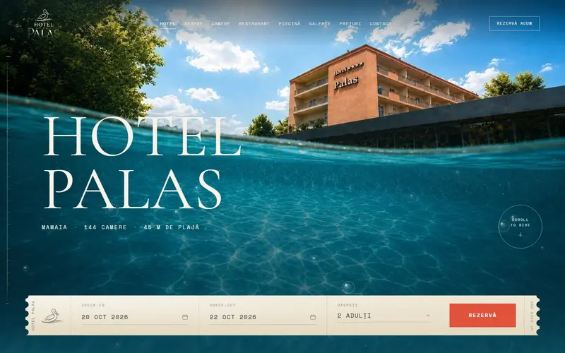
- white text over a bright photo, with no darker layer underneath;
- the hint text inside form fields (the gray example in the box), which vanishes on a screen in sunlight;
- buttons in the brand color (yellow, light green) with white text on them.
The check is easy: take the text color and the background color and run them through a contrast checker. If it fails, darken the text or the background. You don't have to change your brand.
A related rule belongs here too: color shouldn't be the only sign of a piece of information. A link that differs from the surrounding text only by color, or a form field marked as wrong only in red, gets missed by people who don't distinguish colors well. Add an underline, an icon or a written message.
Alt text: what the image says
Alternative text (the alt attribute) is read aloud by screen readers and shows in place of the image when it doesn't load. The W3C has a simple decision tree:
| The image | What goes in alt |
|---|---|
| Decorative (a background, a divider, a texture) | an empty alt, so it gets skipped |
| Contains text that isn't anywhere else | the text in the image |
| Is a link or button (logo back to the homepage, cart icon) | where it goes or what it does |
| Carries information (a photo of a dish, a hotel room) | a short description of what matters |
Restaurant examples: the photo of a dish from the menu gets "Seafood pasta with cherry tomatoes," not "image1.jpg" and not "the best food in town." The corner logo that leads to the homepage gets the business name plus "home page."
A common case: an event poster uploaded as an image, with the date and time written on it. Without alt text, or the same details written on the page, some visitors never find out when the event is.
Keyboard: the site has to work without a mouse
WCAG 2.1 requires that all functionality be operable from a keyboard (success criterion 2.1.1, level A). It also requires that you can see where you are: the focused element needs a visible outline or marker (criterion 2.4.7, level AA).
The test takes five minutes. Open the site, set the mouse aside, and use Tab, then Enter and the arrow keys:
- Can you always see where you are? If someone removed the focus outline from the code, you'll see nothing.
- Can you close the cookie banner?
- Can you open the menu and reach every page?
- Can you fill in and send the contact form?
- Can you close a pop-up window and get back to where you were?
- Does the order you move through the page make sense, top to bottom?
Wherever you get stuck, so does anyone who relies on the keyboard or a device that acts like one.
Why it matters for a small business too
Beyond the customers you lose when they can't read or use your site, there's another reason. The European Accessibility Act (Directive (EU) 2019/882) will apply to services provided to consumers after June 28, 2025, and those include e-commerce services. Microenterprises providing services (fewer than 10 employees, with turnover or balance sheet below the directive's threshold) are exempt, but if you sell online and you're growing, it's simpler to build it right now than to rebuild the site in 2025.
If you've already run the 10 checks on a phone, add these to the same list. And if you want a site built with them in mind from day one, see our web design services.
Sources
- Understanding Success Criterion 1.4.3: Contrast (Minimum), W3Cthe 4.5:1 and 3:1 thresholds, large text, thin fonts
- Understanding Success Criterion 1.4.1: Use of Color, W3Ccolor isn't the only sign of information
- An alt Decision Tree, W3C WAIalt text for decorative images, images of text, and images in links or buttons
- Understanding Success Criterion 2.1.1: Keyboard, W3Ckeyboard operation
- Understanding Success Criterion 2.4.7: Focus Visible, W3Cvisible focus
- Directive (EU) 2019/882 on accessibility requirements, EUR-Lexapplication from June 28, 2025, e-commerce services, microenterprise exemption for services
Checked: surse Xenia Pușcașu · editare Nora Vlăsceanu · SEO Mihnea Tăbăcaru