
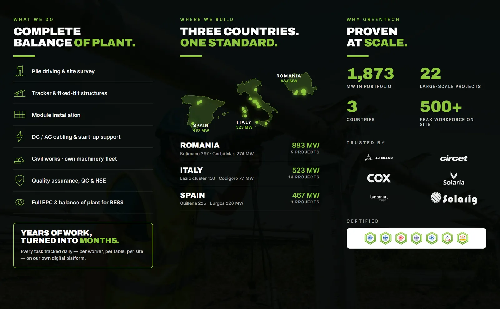

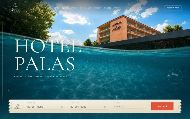
An event poster gets read in three steps: what it is, then when and where, then everything else. The first level has to land while people walk past, from a few meters away. The second, when they slow down. The third, only for whoever stops in front of the poster. If all three are the same size, none of them reads from five meters.
The three levels
Level 1, what it is. The event or artist name, or an image that says on its own what this is about. One element, the biggest thing on the poster. Put two things at the same size and the eye doesn't know where to start.
Level 2, when and where. Date, time and place. It's the information people walk closer for. It should clearly be second in size and grouped together, not scattered into the corners.
Level 3, the details. The schedule, how to get tickets, the organizers, partner logos, a QR code. Only people who've already stopped will read them, so they can be small. This is where everything the organizing committee wants on the poster goes.
The problem we see a lot is level 3 growing until it eats levels 1 and 2: big sponsor logos, three typefaces, an intro sentence at the top. Everything you add makes the rest smaller.
How big the letters need to be
There's solid research on this for signs and storefronts. The United States Sign Council guideline for on-premise signs uses a legibility index: how many feet away you can read for every inch of capital letter height. The guideline's average value is 30. In busy areas, where attention is split, it lowers the index to 25 or even 20.
Converted to metric, by our calculation:
| Situation | 1 cm of capital height reads from | At 5 m you need at least |
|---|---|---|
| Calm, focused viewing (index 30) | about 3.6 m | about 1.4 cm |
| Busy street (index 20) | about 2.4 m | about 2.1 cm |
The same guideline says text set in all caps needs letters about 15% taller to be read from the same distance. At the same size, an all-caps headline has to be read from closer.
These numbers are the minimum for legibility, measured for drivers looking at a sign. For level 2 on a poster, that's a good floor. Level 1 should be several times bigger, because its job is to catch the eye from a distance.
What else helps
- Contrast. Dark text on a light background or the reverse, not gray on gray, and not text over a busy photo. If text sits on a photo, give it a calm area underneath.
- Typeface. For levels 1 and 2, a font with open shapes and a medium to bold weight. Very thin, condensed or decorative fonts get lost at a distance.
- White space. A poster with room around the headline reads faster than one filled to the edges.
- Few typefaces. One or two are enough. Build the hierarchy from size and weight.
The distance test, before printing
You don't need the full-size poster to test it. A-series paper sizes are proportional: A4 (210 × 297 mm) is exactly half the width and height of A2 (420 × 594 mm). So an A4 sheet viewed from 2.5 m looks about the same as an A2 poster from 5 m.
- Print the poster on A4, on any office printer.
- Tape it to a wall and step back to the distance that matches the final format (for A2 at 5 m, that's 2.5 m).
- Look for two seconds, then turn around and say what you remember.
- If you didn't catch the event name and the date, levels 1 and 2 aren't big enough or aren't set apart enough from the rest.
Ask someone who hasn't seen the poster to do the test. You know it by heart, so you're not a good reader for it.
A printed poster pairs well with a banner or a storefront sign. The print file needs bleed and a safe margin, especially if the background runs to the edge of the sheet.
Sources
- USSC Guideline Standards for On-Premise Signs, United States Sign Council Foundation (2018)the legibility index (average of 30 feet per inch of capital height, adjusted to 25 and 20 in busy areas), 15% more height for all-caps text
- International standard paper sizes, Markus Kuhn, University of CambridgeISO 216 dimensions: A4 = 210 × 297 mm, A2 = 420 × 594 mm
Checked: surse Xenia Pușcașu · editare Nora Vlăsceanu · SEO Mihnea Tăbăcaru