
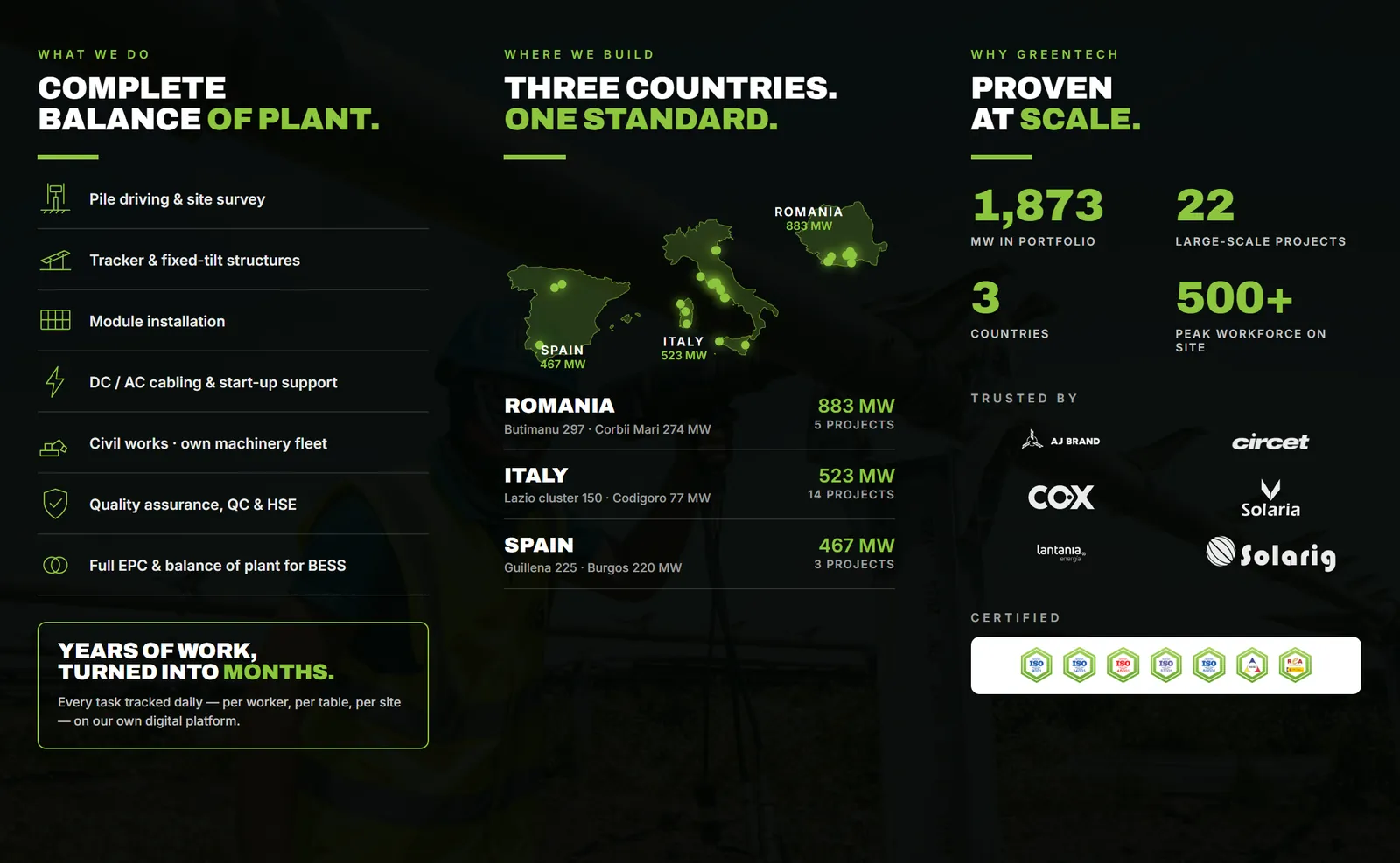

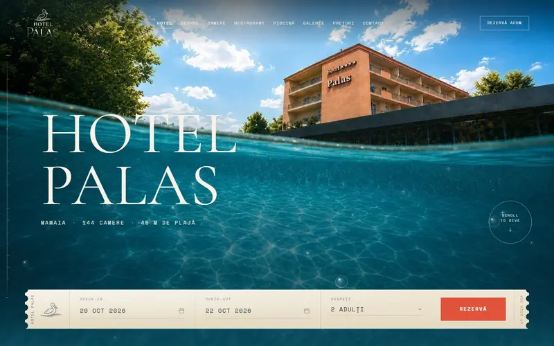
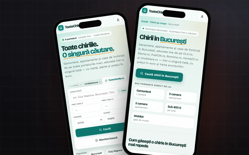

The homepage of a business website has to say, within a few seconds, what you do, who it's for, and what the visitor can do next: call, book, or ask for a quote. Everything after that is proof: your work, real photos, what customers say, your address and hours. If visitors have to guess what you sell, they leave.
You have a few seconds
Jakob Nielsen of the Nielsen Norman Group looked at how long people stay on web pages and came to a simple conclusion: many leave within 10 to 20 seconds. The ones who make it past those first seconds, though, stay much longer. His advice: to earn a few minutes of attention, you have to communicate your value clearly within 10 seconds.
That changes how you write the headline. "Welcome to our website" says nothing. "Plumbing and heating for homes and apartment buildings, same-day callouts" says everything it needs to, even if it's longer.
The first screen
What people see before scrolling gets most of their attention. A 2018 Nielsen Norman Group eyetracking study found that 57% of viewing time goes to the first screenful and 17% to the second. People do scroll, but attention drops off quickly after the first screen.
On the first screen, put:
- A headline that says what you do, and possibly where you work.
- One supporting sentence: who it's for, what sets you apart, something concrete ("Open Saturdays too," "Delivered within 48 hours").
- One main button: "Call now," "Book a table," "Get a quote." On a phone, the call button should start the call directly.
- A real photo: your place, your team, your work. A stock photo of people smiling at a desk says nothing about you.
The rest of the page, in the order people ask
Think about what a customer asks on the phone and lay out the sections in that order:
- What you do, briefly. Three to six services, each with one line of explanation and a link to its own page.
- What it looks like. Your work, photos of your place, before and after. Your own photos beat any copy.
- What others say. A few real reviews, with names as they were left. Don't make them up and don't rewrite them.
- How you work. The steps, if your service has steps: request, visit, quote, job done.
- Where and when. Address, service area, hours, map.
- Contact. Phone, WhatsApp or a short form, once more at the bottom.
Each section has one job. If a section doesn't answer a real customer question, cut it.
What to leave out
We see the same mistakes on a lot of business websites:
- The five-image slider that rotates on its own. Your main message should stay put, not slide away after a few seconds.
- The pop-up on arrival that covers the page. People came to find something out, not to close windows.
- Copy that fits anyone: "quality," "professionalism," "reliability." Say one thing that can be checked instead.
- A 12-item menu. Five or six are plenty for a business website.
Technical details that ruin the first impression
The big hero image. It's usually the largest element on screen, which makes it the one Google uses to measure LCP, the moment the main content appears. A photo uploaded straight from the camera, uncompressed, slows down exactly that first impression. We explained this in detail in our post on Core Web Vitals.
Text over a photo. The WCAG 2.1 accessibility guidelines call for a contrast ratio of at least 4.5:1 for regular text and 3:1 for large text. A white headline over a bright photo fails that easily, and you can't read it on a phone in the sun.
The phone. Check your homepage on an ordinary phone first, not on the big monitor at the office. That's where you'll spot text that's too small and buttons that are hard to tap.
Checklist
- Can a stranger tell what you do within 10 seconds?
- Is there one main button, visible without scrolling?
- Are the photos yours?
- Can people find your address, hours and phone without hunting?
- Does the page load fast on an average phone?
If you want to start from scratch or redo the homepage of your current site, our web services page shows how we work.
Sources
- How Long Do Users Stay on Web Pages?, Nielsen Norman Grouppeople often leave within 10 to 20 seconds, and the main message has to land in the first 10
- Scrolling and Attention, Nielsen Norman Group57% of viewing time on the first screenful and 17% on the second (2018 study)
- Web Content Accessibility Guidelines (WCAG) 2.1, W3Csuccess criterion 1.4.3: 4.5:1 contrast for text and 3:1 for large text
- Largest Contentful Paint (LCP), web.devwhich elements can be the LCP (images, large text blocks) and the 2.5 second threshold
Checked: surse Xenia Pușcașu · editare Nora Vlăsceanu · SEO Mihnea Tăbăcaru