

On a salon website, the booking button belongs on the first screen of the phone and stays in view while people scroll. The rest of the page (services, team, photos, address) is there to convince them to tap it. If they have to hunt for the button, a lot of them close the tab and message another salon on Instagram.
Why the first screen
People who land on a salon's website usually already know what they want: an open slot. They saw a reel, got a recommendation, searched "nail salon" nearby. They don't need a long story first. They need the shortest path to a booking.
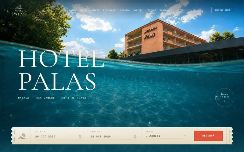
So the first screen on a phone holds three things: what you do (one sentence), a real photo from your salon and the button. That's it.
And nothing on top of them. Google advises against covering page content with full-screen overlays and suggests using small banners if you have something to announce. A "Subscribe to our newsletter" pop-up that lands right on top of the booking button costs you bookings.
What the button looks like
- The label says what happens: "Book now," not "Contact" or "Learn more."
- It's big. The WCAG 2.2 accessibility standard requires, at level AA, that touch targets be at least 24 by 24 CSS pixels. That's the floor. We make the main button the full width of the screen, sized for a thumb.
- It stays in view: a fixed bar at the bottom with "Book now," WhatsApp and "Call." People scroll through photos and the button is always under their thumb.
- It stands out: a strong color with good contrast against the background, not a thin gray outline.
Where it leads
The best path is a booking system where people pick the service, the stylist and an open time, without waiting for a reply. We covered what a system like that does in our article on booking apps.
If you take bookings on WhatsApp for now, the button can open the chat with a message already typed: "Hi, I'd like to book a..." The customer fills in the service and the day. For people who'd rather call, "Call" starts the call in one tap.
What matters is having one main path. Three different buttons, each going to a different system, just confuse people.
What goes below the button
Below the first screen come the answers, in the order people ask the questions:
- Services, each with its duration and price, so people know what they're booking.
- Real work, by category (nails, hair, brows). No stock photos.
- The team, with what each person does. Many people book with someone specific.
- Address, map and hours, including days when they're different.
- The questions people ask first: how long it takes, what to bring, how to cancel.
After each section, the booking button shows up again, not just at the top.
The same details on Google
Your Google Business Profile should say the same thing as your website: your hours, including special holiday hours, and your phone number. For some categories, Google also lets you add dedicated appointment links next to your website.
In your site's code, schema.org structured data has a specific type for salons, BeautySalon, which is a kind of HealthAndBeautyBusiness and, above that, a LocalBusiness. It tells Google plainly what you are, using the same details as the page. We gave a quick explanation of how this works in our schema.org article.
We design salon and studio websites for phones first; see our work.
Sources
- Interstitials and dialogs, Google Search Centralno overlays covering the whole page, small banners instead
- Understanding Success Criterion 2.5.8: Target Size (Minimum), W3C WAItouch targets of at least 24 by 24 CSS pixels, level AA
- Edit your Business Profile, Google Business Profile Helphours, special hours and extra appointment links for some categories
- BeautySalon, schema.orgthe BeautySalon type, under HealthAndBeautyBusiness and LocalBusiness
Checked: surse Xenia Pușcașu · editare Nora Vlăsceanu · SEO Mihnea Tăbăcaru