


A spa website has to do two things at once: calm you down and get you to book. The calm comes from space, good photos and very little motion. The booking comes from a button that never disappears and prices you can read without asking anyone.
Calm doesn't mean empty
People visit a spa's website to picture how they'll feel there. White space and big photos help. But an "airy" site that doesn't tell you what you get, how long you stay and how to book is just pretty.
Start from what the place offers: the pool, the sauna, the relaxation area. The first screen explains in a few lines what you get. The facilities can be cards, each with its own photo. If you also host parties or team-building events, give them their own section instead of burying them in the footer.
Big photos, light files
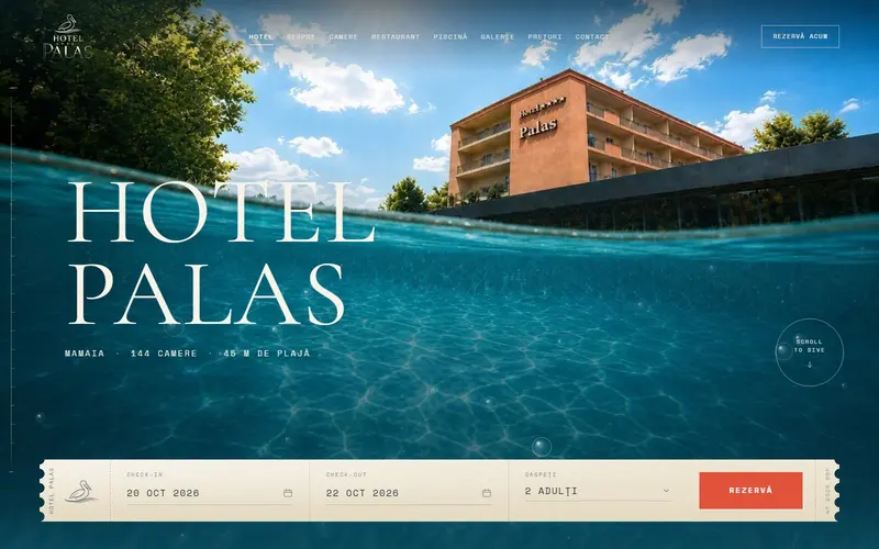
The photo at the top of the page is usually the largest element visible when it loads. That makes it exactly what Google measures for LCP (Largest Contentful Paint), the time until the main content shows up. The recommended target is 2.5 seconds or less for 75% of visits, measured separately on mobile and desktop.
In practice:
- export the main photo at the size it's displayed, not the size it came off the camera;
- use modern image formats and separate versions for phones and large screens;
- use a background video only with a light poster image, because the poster counts toward LCP too.
A spa whose site crawls on mobile data sends the opposite message of relaxation.
Gentle motion and the "reduce motion" setting
Slow animations that fade in as you scroll suit a spa. Big zooms and backgrounds sliding under the text, less so. For some people, motion on screen causes real physical discomfort.
Phones and computers have a "reduce motion" setting, and a website can read it through prefers-reduced-motion. When it's on, animations stop or turn into simple fades. For a site meant to be calming, that's a setting worth respecting.
Text people can actually read
Spa palettes are often cream, beige and light gray. They look great on a mood board and bad when gray text sits on a cream background. The WCAG accessibility standard asks for a contrast ratio of at least 4.5:1 for regular text and 3:1 for large text. Keep the warm colors for backgrounds and accents, and make the text dark enough.
Prices are where this matters most. They should be readable on a phone without zooming, so visitors see the rates without messaging anyone.
Booking, always in sight
The decision happens on the phone. The "Book now" button stays in the corner of the screen wherever you are on the page. Next to it, WhatsApp opens straight from the site for anyone who wants to ask something first.
It also helps to show:
- opening hours written clearly, including days with different hours;
- what to bring (swimsuit, slippers) or what's provided;
- the simple rules: minimum age, cancellations, what happens if you're late.
Details for Google
Schema.org has a specific type for day spas, DaySpa, which inherits everything a local business has: address, hours, even special holiday hours. Marked up correctly, it helps Google understand what you are and when you're open.
If you want a spa website that looks calm and fills the schedule, see what our Web Design studio does.
Sources
- Largest Contentful Paint (LCP), web.devthe 2.5-second target at the 75th percentile, split by mobile and desktop; which elements count (images, video posters, backgrounds)
- prefers-reduced-motion, MDN Web Docsthe reduce-motion setting and the discomfort large animations can cause
- Understanding Success Criterion 1.4.3: Contrast (Minimum), W3Cminimum contrast of 4.5:1 for regular text and 3:1 for large text
- DaySpa, Schema.orgthe DaySpa type, inherited from LocalBusiness, with opening hours and special hours
Checked: surse Xenia Pușcașu · editare Nora Vlăsceanu · SEO Mihnea Tăbăcaru