


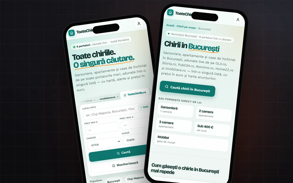

Before we launch a website, we open it on an actual phone and go through ten checks. It takes about an hour and catches nearly everything that ruins a first impression. It matters for Google too: Google uses the mobile version of a site to index and rank it.
First things first: the phone is the main version
Google says plainly that it uses the mobile version of a site's content, crawled with a smartphone agent, for indexing and ranking. That flips the order: you don't build for the desktop and then "adapt" it. You check on the phone first.
The ten checks
1. The page has a viewport tag
Without a meta viewport tag set to "width=device-width, initial-scale=1", some mobile browsers render the page as if on a wide desktop screen and then shrink it. Everything comes out tiny. MDN's documentation describes exactly this behavior.
2. Zoom isn't blocked
Some themes add "user-scalable=no" to that same tag so the "design doesn't break." MDN warns that this stops people with low vision from reading the page. Leave zoom on.
3. No sideways scrolling
Swipe left on every page. If the page slides sideways, something is wider than the screen: an image, a table, a map iframe. It's a CSS fix, but you have to find it first.
4. Text reads without zooming
Body text should be readable with the phone held normally. If you catch yourself pinching to read a paragraph, the font is too small or the lines are too cramped.
5. Buttons and links are easy to tap
Chrome's Lighthouse tool checks "tap targets": a 48 × 48 pixel button never fails the audit, and 8 pixels between targets is a good starting point. The usual offenders: menu links packed too close together and tiny social icons in the footer.
6. Phone number and address are tappable
A phone number set as a "tel:" link starts the call directly. An address linked to a map opens navigation. On a phone, nobody copies numbers by hand.
7. The form works with a thumb
The email field brings up the keyboard with "@", the phone field brings up the number pad. The keyboard doesn't cover the submit button. Send a test message yourself from the phone, on mobile data, not Wi-Fi. More in our article on contact forms.
8. The page loads fast on mobile data
Google measures loading experience through Core Web Vitals. For loading, the target is a Largest Contentful Paint (how long until the largest visible element appears) of 2.5 seconds or less. The usual culprit is the big hero image, uploaded straight from the camera. We covered image format and size in our article on website images.
9. The page doesn't jump while you read
You tapped a link, but a banner loaded at the last moment and you hit something else. That's what Cumulative Layout Shift measures, and web.dev recommends a score of 0.1 or less. The fix is giving images dimensions and reserving space for banners and the cookie bar.
10. Mobile has everything desktop has
It's tempting to hide sections on phones "to keep it clean." Google asks that the mobile site have the same content as the desktop one, the same headings, the same structured data and the same image alt text. Whatever is missing on mobile is, in practice, missing for Google.
How to test
On a computer, Chrome DevTools has a device mode that simulates a phone screen. It's fine for a first pass. But the final check happens on real phones, one Android and one iPhone, on mobile data. That's how you see what the customer sees.
If you'd like us to go through your site together, see what we do on the Web side.
Sources
- Mobile-first indexing best practices, Google Search CentralGoogle indexes and ranks the mobile version, same content, structured data and alt text
- Viewport meta tag, MDN Web Docswhat width=device-width does and why blocking zoom hurts accessibility
- Tap targets are not sized appropriately, Chrome Developers48 × 48 px targets and 8 px spacing
- Largest Contentful Paint (LCP), web.devthe 2.5-second LCP threshold
- Cumulative Layout Shift (CLS), web.deva good CLS score is 0.1 or less
Checked: surse Xenia Pușcașu · editare Nora Vlăsceanu · SEO Mihnea Tăbăcaru