
04 / 07 · Construction · photovoltaics · manpower · data centres · Romania
PureElektric
Black and gold, like a solar panel in full sun.

What we did
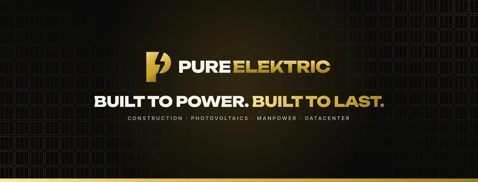
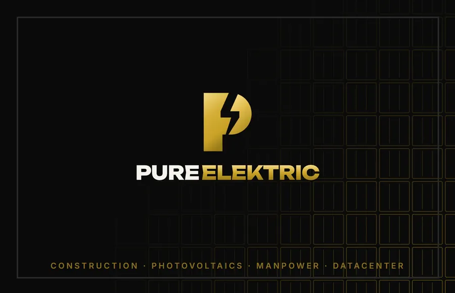
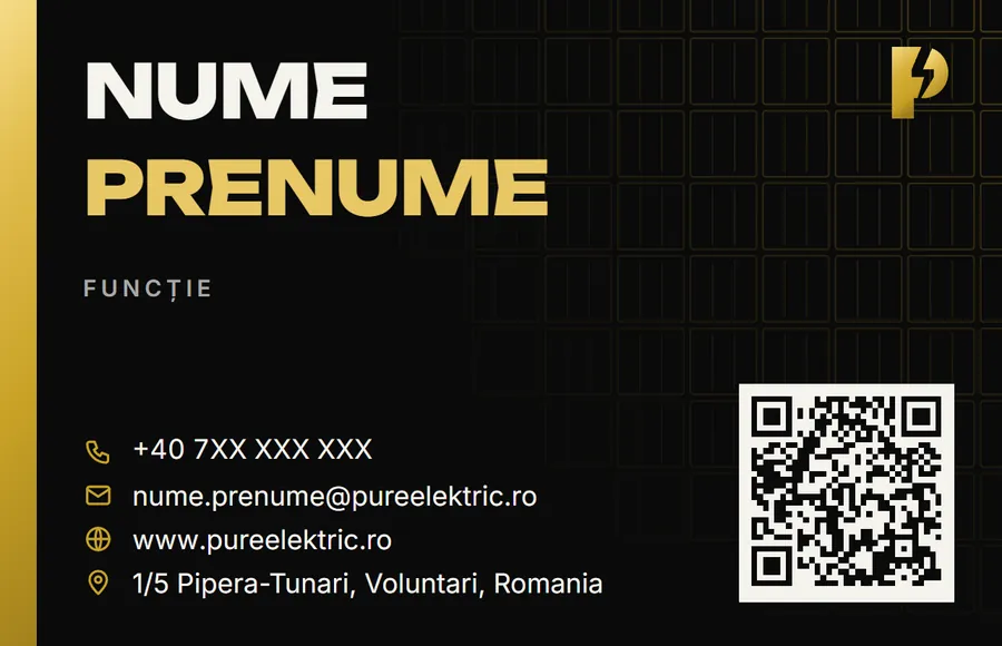
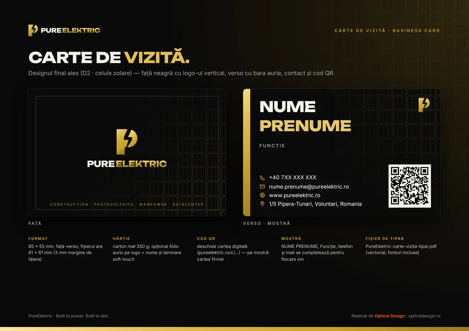
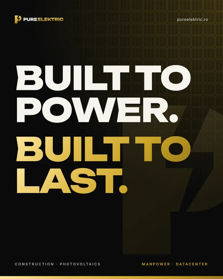
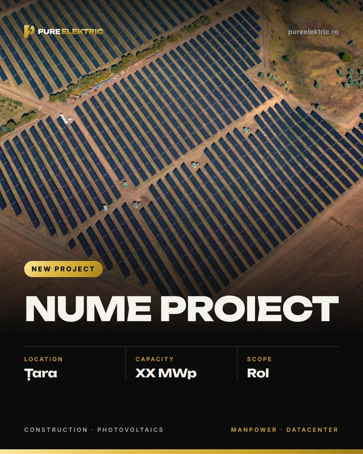
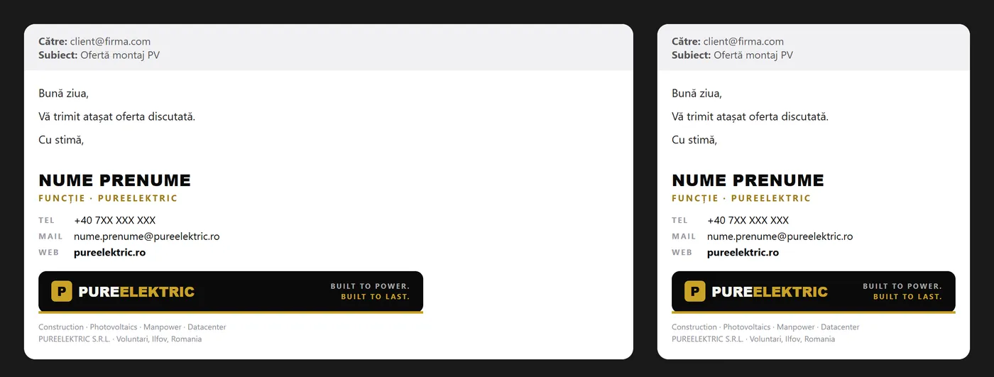
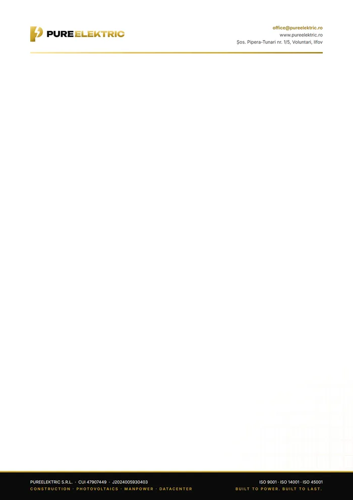
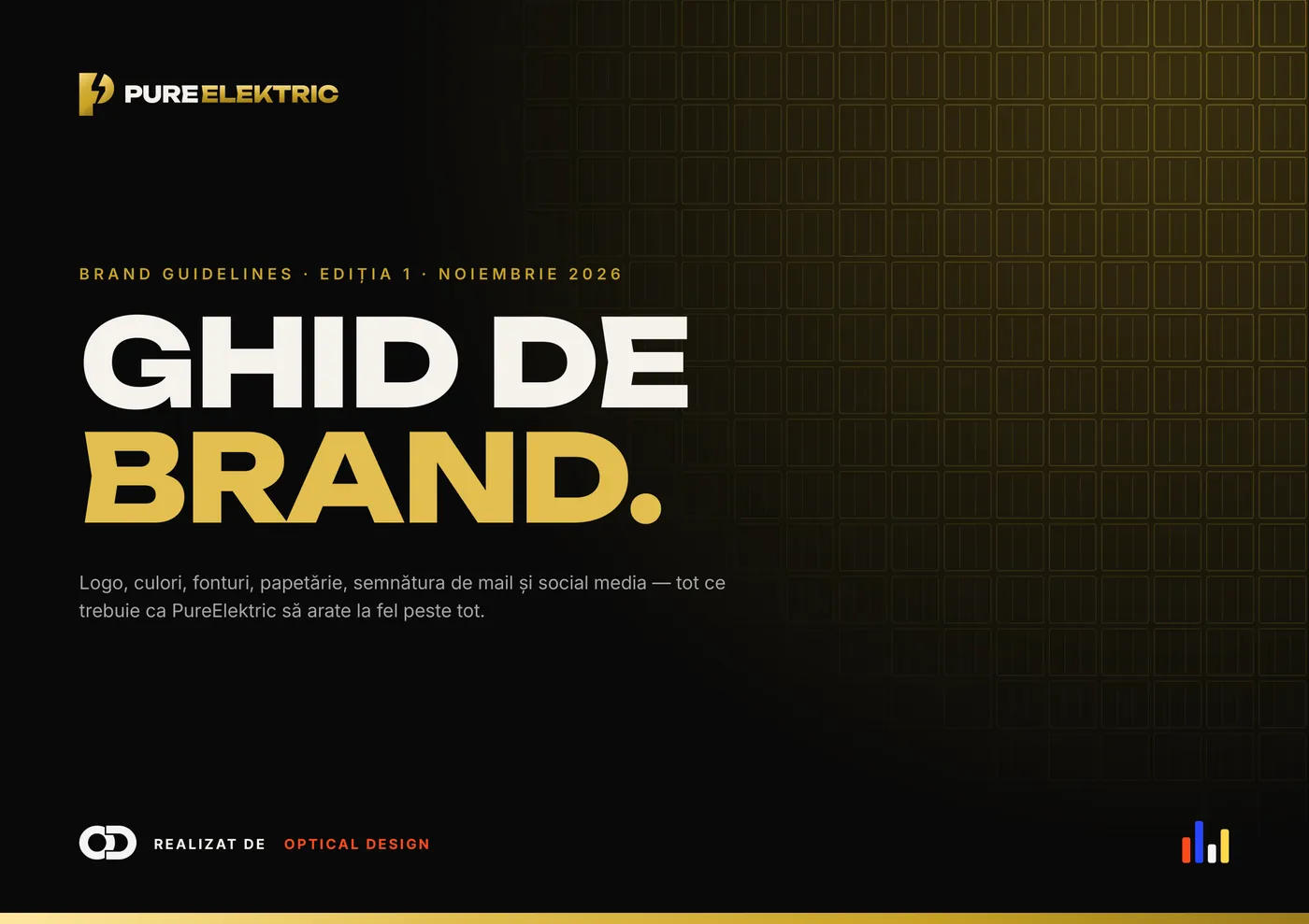
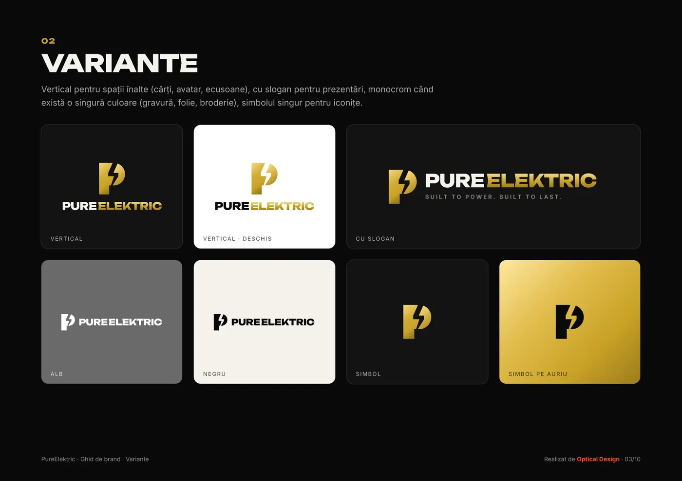
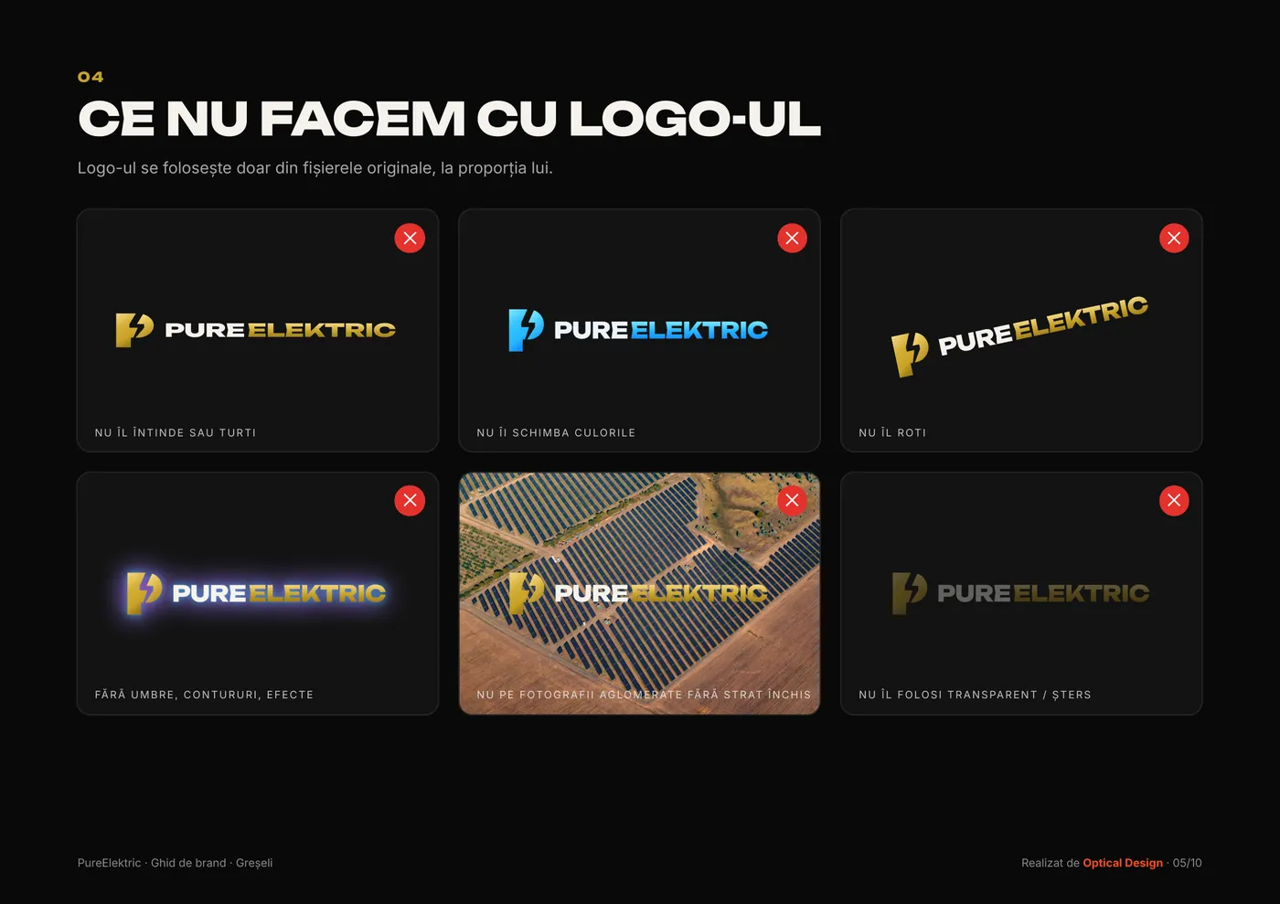
The lightning bolt inside the “P” became the brand mark, and the line “Built to power. Built to last.” ties everything together: business cards, covers, posts and the letterhead. We also wrote the rules down in a 10-page guide, so the brand looks the same whoever uses it.
- 17 logo versions
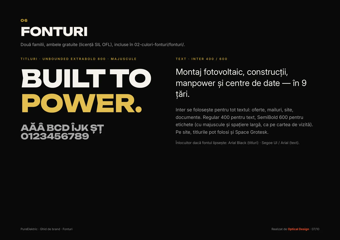
- Colours & fonts
- Business card
- E-mail signature
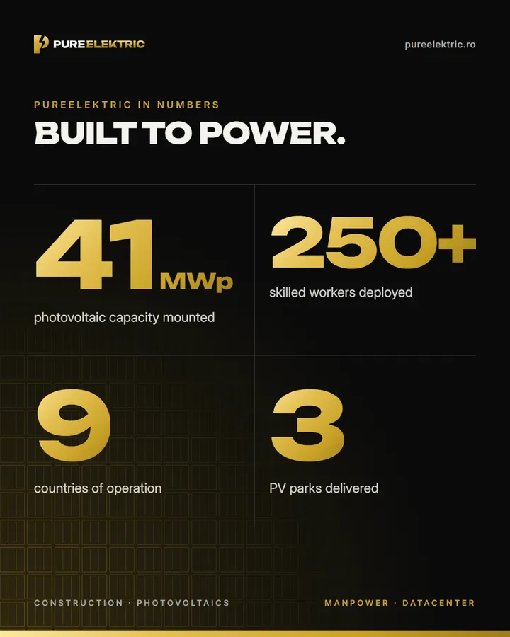
- Social media
- Letterhead
- Brand guidelines · 10 pages
Colours
- Black#0A0A0A
- Gold#C9A227
- Light gold#E8C766
- Dark gold#9C7C1C
- Ivory#F5F3EC
- Grey#A8A8A8
Fonts
Unbounded ExtraBold for headlines · Inter for text
01The logo, on dark and light


02Business card
03Social media
04E-mail signature & letterhead
05The brand guidelines
The names, phone numbers and e-mails on the business cards and signatures shown here are samples.

Got something to build?
Tell us what you do and what’s missing. We come back with a plan and a timeline. The price comes in the quote, not out of thin air.