

Logos for lawyers, notaries and accountants.
In a practice, the logo lives mostly on paper: on contracts, invoices and in the corner of every e-mail. It doesn’t need to shout. It needs to look confident, orderly and easy to remember, from the first meeting.
What matters
Legal & accounting
- 01
The corner of the page
On letterhead, contracts and invoices, the logo sits small in a corner. It has to read at that size and after a black-and-white photocopy.
- 02
The e-mail signature
Most correspondence goes by e-mail. The logo in the signature has to be light and clear on a phone screen.
- 03
The plaque by the door
In office buildings you share a board with other firms. A clean plaque with a well-set name makes you easy to find.
- 04
No scales, no columns
Scales, gavels and classical columns are on nearly everyone’s logo. A name-based logo or a well-drawn monogram says more about your practice.
What you get
The deliverables, in short. What exactly is included goes in the quote.
- 01
Logo and monogram
A version with the full name and a monogram from your initials, for small spaces.
- 02
Stationery
Letterhead, envelope, document folder and a cover page for contracts and reports.
- 03
E-mail signature
A signature for each lawyer or adviser, with the logo and contact details.
- 04
Business card
One layout for the whole team, with room for title and specialism.
- 05
The entrance plaque
A layout for the plaque on the door or the building’s directory board.
- 06
LinkedIn profile
Profile picture and banner for the firm’s page and its partners.
- SVG and vector PDF
- Transparent PNG
- Black-and-white version for office printers
- Image for the e-mail signature
- CMYK, RGB, HEX and Pantone colour codes
How we work
Four steps, from the first message to the final files.
- 1
The talk
You tell us what you do, who you sell to and what you don’t want to look like. We also look at competitors.
- 2
The directions
We show you the logo directions on real applications: storefront, business card, profile.
- 3
Refinement
You pick a direction, we take it all the way. Rounds of changes are written in the quote.
- 4
The final pack
Vector logo in every version, colours, fonts and usage rules.
Work we made
Only real projects, already on our site.




Questions
What clients ask us.
The firm carries the partners’ names. What happens when they change?
We design the logo as a system: a mark or monogram that stays, with the names set by a clear rule. When a partner joins or leaves, only the text changes.
Won’t a serious logo look boring?
Serious doesn’t mean bland. We work with well-chosen letters, proportions and one detail with character, so you look confident without looking like every other firm.
Will it print well on our office printer?
Yes. We test the logo printed in black and white on ordinary paper, and scanned, because that is how most documents reach the client.
Who owns the logo in the end?
You do. After full payment, the economic rights to the final deliverables pass to you through a written assignment, as set out in our Terms.
I already have a logo. Can you reuse it?
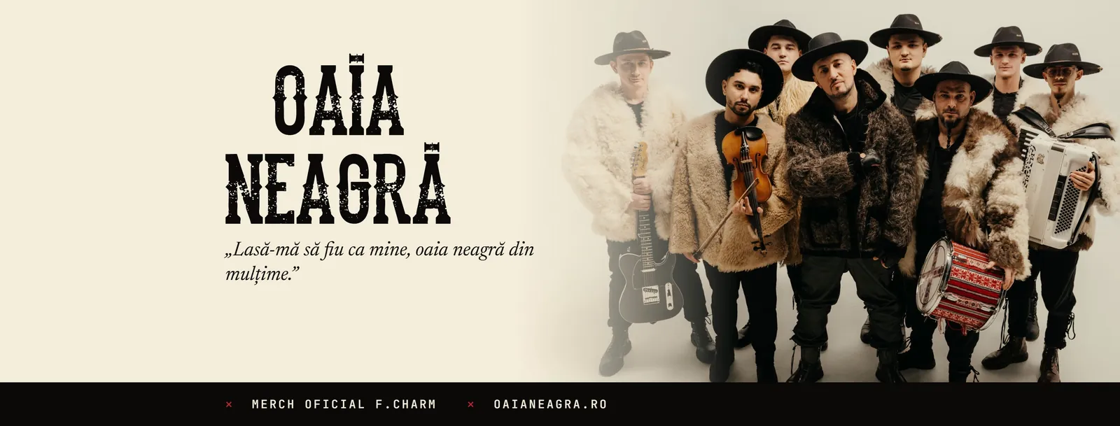
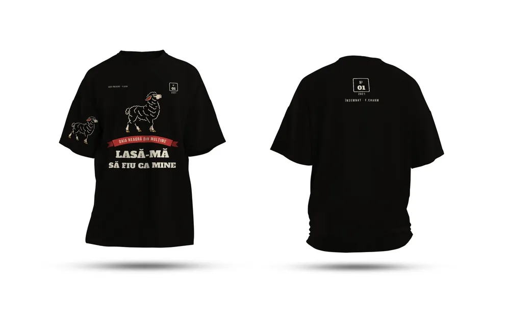
Yes. Often you don’t need a new one: we redraw it cleanly as a vector and build the rest of the identity around it, as we did for Oaia Neagră and Major Music.
How much does it cost?
It depends on what it covers: how many pieces, how many versions, whether printing or production is included. Tell us what you need and we come back with a clear quote, after a short talk.
From the blog
Short guides on the topic, written in the studio.
Brand identities
Let’s start.
Tell us in two lines what you need. We come back with a plan and a clear quote.