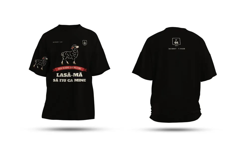
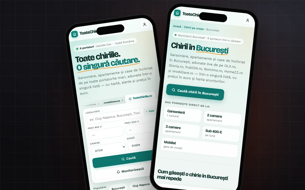
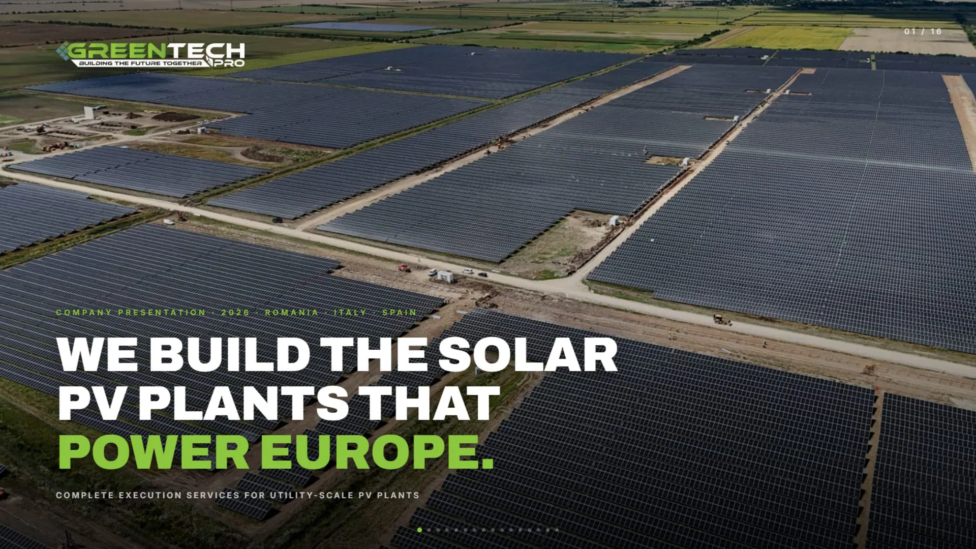
Logos for software and tech startups.
A software company’s logo lives almost entirely on screens: in the browser tab, on the phone, in the pitch deck. We build apps too, through Optical App Dev, so we draw it for the screen from the start, down to icon size.
What matters
IT & startups
- 01
App icon and favicon
The mark has to be recognisable in a browser tab, at a few pixels, and in the rounded square on a phone’s home screen.
- 02
Dark mode
Your app almost certainly has a dark theme. The logo gets versions designed for both, not just inverted colours.
- 03
In motion
The splash screen, the loading animation and the video intro. A logo built from simple shapes is easy to animate.
- 04
No globes, no circuits
Globes, circuit boards, code brackets and the blue cloud are everywhere. We look for a mark that says what your product does.
What you get
The deliverables, in short. What exactly is included goes in the quote.
- 01
Logo and mark
The version with the name, the mark on its own and versions for dark and light themes.
- 02
App icon and favicon
The full icon set for iOS, Android, the web and the browser.
- 03
Splash screen and motion
The app’s splash screen and a short logo animation, on request.
- 04
Pitch deck and presentation
A presentation template for investors and clients, in the new identity.
- 05
Profiles and the team
LinkedIn avatar and banner, plus stickers and T-shirts for the team.
- SVG and vector PDF
- Transparent PNG for dark and light themes
- Icon set for iOS and Android
- Favicon in ICO and PNG
- RGB and HEX colour codes, plus CMYK for print
How we work
Four steps, from the first message to the final files.
- 1
The talk
You tell us what you do, who you sell to and what you don’t want to look like. We also look at competitors.
- 2
The directions
We show you the logo directions on real applications: storefront, business card, profile.
- 3
Refinement
You pick a direction, we take it all the way. Rounds of changes are written in the quote.
- 4
The final pack
Vector logo in every version, colours, fonts and usage rules.
Work we made
Only real projects, already on our site.


Questions
What clients ask us.
The name isn’t final yet. Can we start?
We can talk directions, but the logo is drawn on the final name. Before that, check that the domain is free and that the name isn’t already a registered trademark.
Should the logo look like the big tech companies’?
No need. A simple logo suits screens, but simple doesn’t mean the same as everyone. We look for one detail that is yours alone.
Can you build the app too?
Yes, through Optical App Dev: web and mobile apps, designed in the same identity.
Who owns the logo in the end?
You do. After full payment, the economic rights to the final deliverables pass to you through a written assignment, as set out in our Terms.
I already have a logo. Can you reuse it?
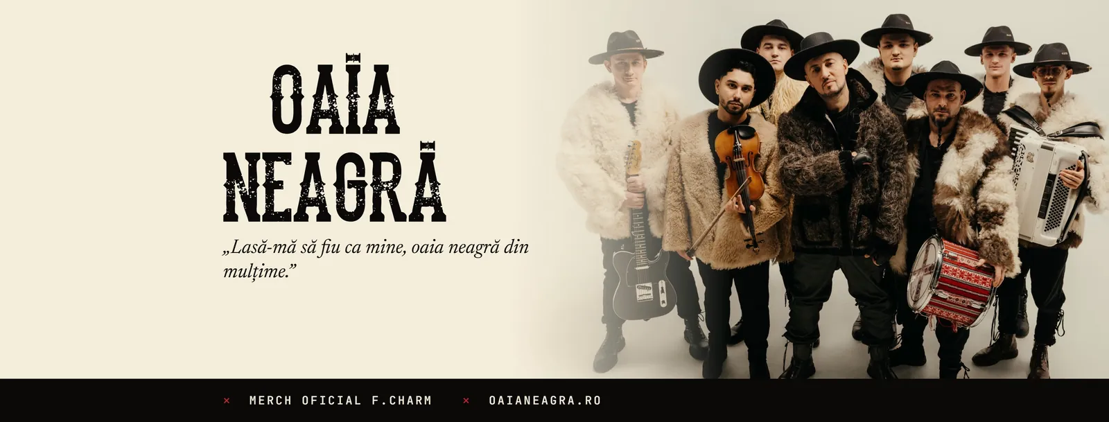
Yes. Often you don’t need a new one: we redraw it cleanly as a vector and build the rest of the identity around it, as we did for Oaia Neagră and Major Music.
How much does it cost?
It depends on what it covers: how many pieces, how many versions, whether printing or production is included. Tell us what you need and we come back with a clear quote, after a short talk.
From the blog
Short guides on the topic, written in the studio.
Brand identities
Let’s start.
Tell us in two lines what you need. We come back with a plan and a clear quote.