

Clinic, dental and pharmacy logos.
People walk into a clinic with nerves. The logo is one of the first things they see: on the plaque by the door, at reception, on the prescription. It has to say calm, clean and trustworthy, without looking like every other practice.
What matters
Medical
- 01
Trust before trends
Patients come in every age. The logo has to read easily even for weaker eyes, with clear letters and good contrast.
- 02
The red cross is off-limits
A red cross on white is an emblem protected by law and can’t be used in a clinic’s logo. Pharmacies often use a green cross, but we also look for something that sets you apart from the one across the street.
- 03
Paperwork and uniforms
The logo goes on prescriptions, forms, results envelopes and scrubs. We make versions that print well on the reception printer and embroider cleanly.
- 04
No smiling teeth
Smiling teeth, stethoscopes and heartbeat lines are on half the practices out there. We start from your name, your specialty and how you treat people.
What you get
The deliverables, in short. What exactly is included goes in the quote.
- 01
The logo in every version
The main version, a mark for profiles and single-colour versions for documents and embroidery.
- 02
Plaque and signage
The entrance plaque, the reception and the signs to each room, in the same identity.
- 03
The paperwork
Letterhead, prescription pad, patient form, results envelope and e-mail signature.
- 04
Coats and uniforms
The logo prepared for embroidery on lab coats and scrubs.
- 05
Business and appointment cards
With the address, phone number and space for the next visit.
- SVG and vector PDF
- Transparent PNG
- Black-and-white version for office printers
- Simplified version for embroidery
- CMYK, RGB, HEX and Pantone colour codes
How we work
Four steps, from the first message to the final files.
- 1
The talk
You tell us what you do, who you sell to and what you don’t want to look like. We also look at competitors.
- 2
The directions
We show you the logo directions on real applications: storefront, business card, profile.
- 3
Refinement
You pick a direction, we take it all the way. Rounds of changes are written in the quote.
- 4
The final pack
Vector logo in every version, colours, fonts and usage rules.
Work we made
Only real projects, already on our site.


Questions
What clients ask us.
Can we use a cross in the logo?
Not a red cross on white: it is a protected emblem. A cross in another colour or shape is possible, especially for pharmacies, but we also show you directions without one, so you don’t look like everyone else.
Does the logo have to be blue or green?
Not at all. Blue and green are common because they feel reassuring, but a children’s dentist or an aesthetics clinic can go elsewhere. We choose for your patients.
We have several practices. How do we tie them together?
With a shared mark and a naming system: each location or specialty gets the same shape with its own name. That way patients recognise the clinic wherever they walk in.
Who owns the logo in the end?
You do. After full payment, the economic rights to the final deliverables pass to you through a written assignment, as set out in our Terms.
I already have a logo. Can you reuse it?
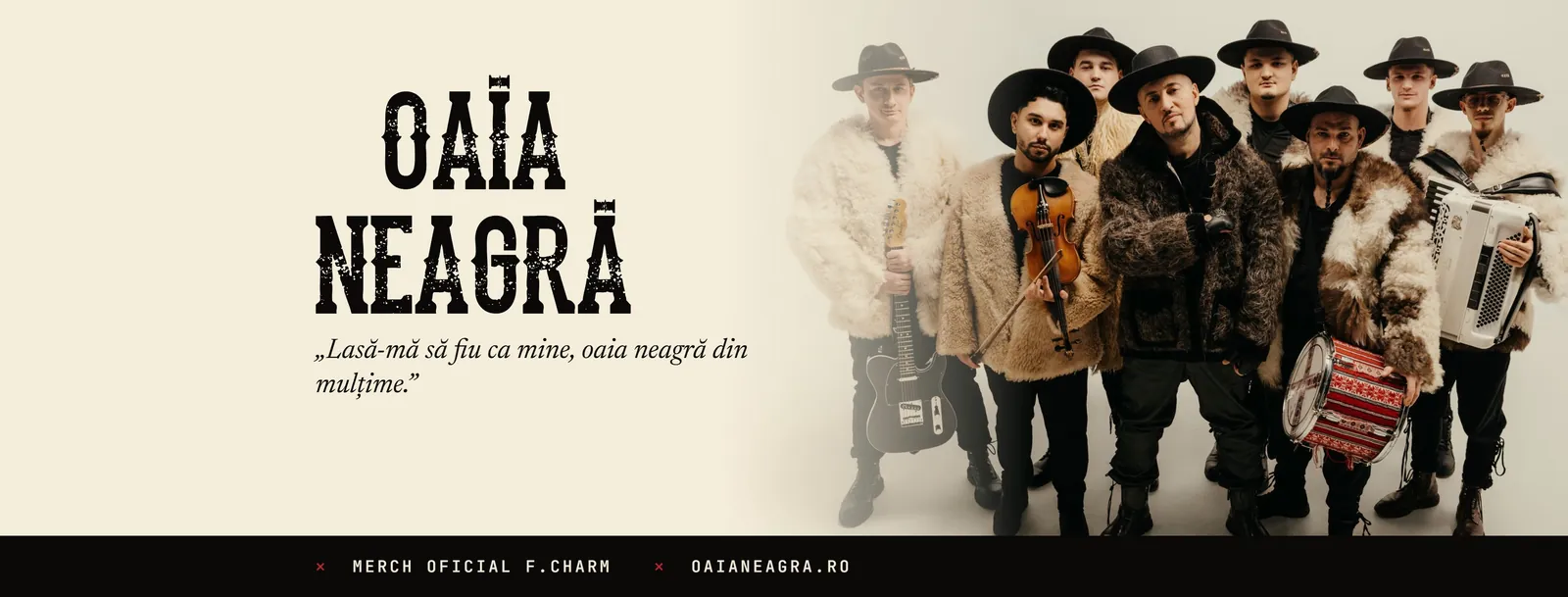
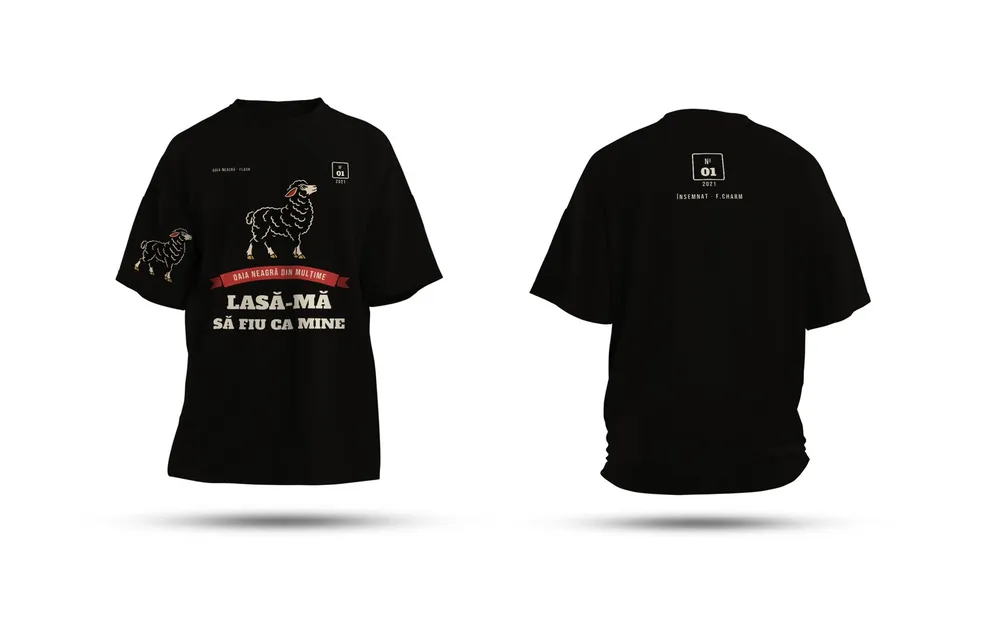
Yes. Often you don’t need a new one: we redraw it cleanly as a vector and build the rest of the identity around it, as we did for Oaia Neagră and Major Music.
How much does it cost?
It depends on what it covers: how many pieces, how many versions, whether printing or production is included. Tell us what you need and we come back with a clear quote, after a short talk.
From the blog
Short guides on the topic, written in the studio.
Brand identities
Let’s start.
Tell us in two lines what you need. We come back with a plan and a clear quote.