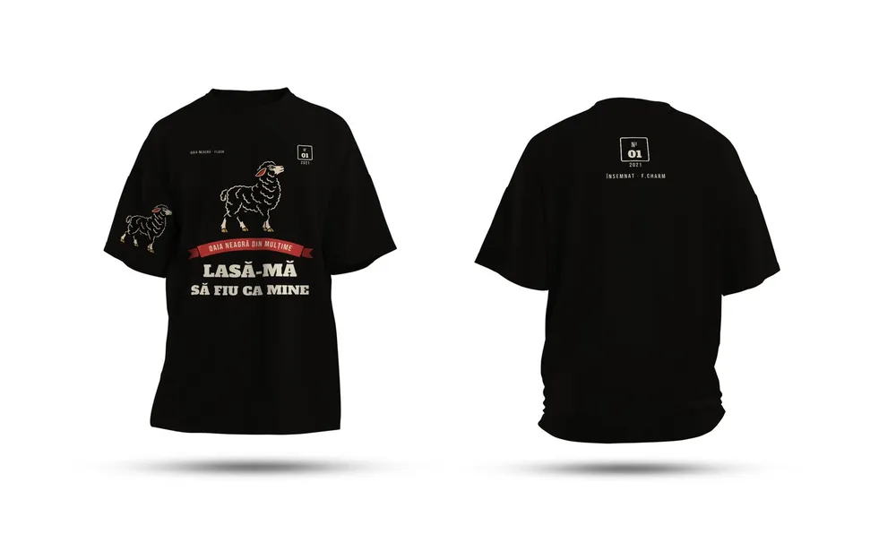
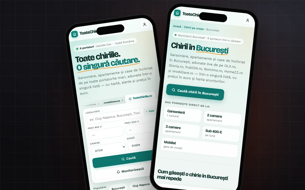
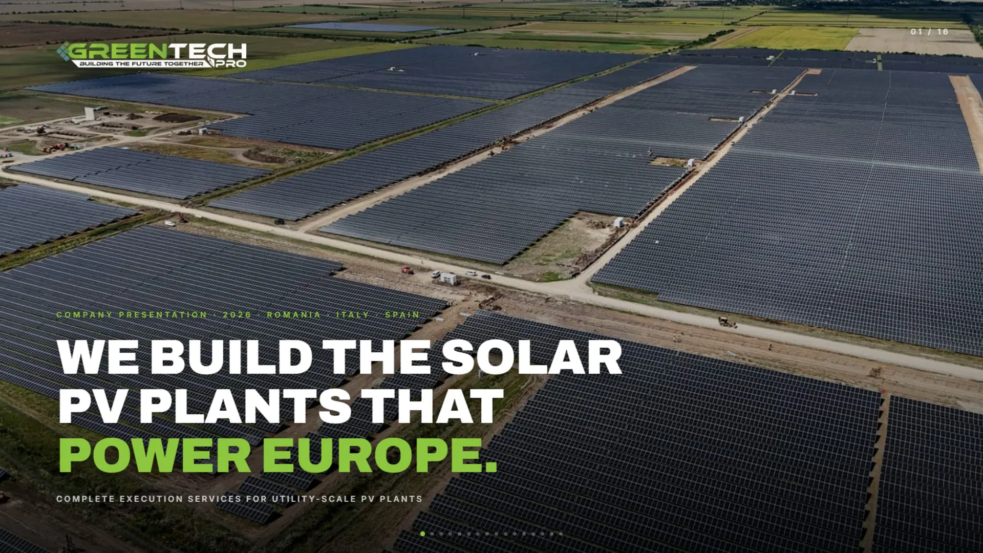
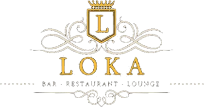
Restaurant logos.
A restaurant logo is first seen on the sign, at night, from the pavement. Then on the menu, the napkin and the delivery bag. We draw it to look just as good on all of them, not only on screen.
What matters
Restaurants
- 01
The sign on the street
It has to read from a distance and at night, lit up. The name stays big and clear, without fine details that vanish on illuminated letters.
- 02
The stamp and the packaging
Boxes, bags and cups are usually printed in a single colour. The logo has to work that way too, without gradients.
- 03
The dot in the apps
In delivery apps and on Google, your logo is a circle the size of a fingernail. We make a compact version, just the mark or the initial.
- 04
Colours that suit the food
The palette tells people what kind of place you are: warm and family-run, quick and urban, or fine dining. We pick it for the kitchen and the room, not for the trend.
What you get
The deliverables, in short. What exactly is included goes in the quote.
- 01
The logo in every version
The main version, a compact one for profiles and apps, plus single-colour, white and black versions.
- 02
The menu header
The logo placed on the printed menu, the specials board and the QR menu, with the identity’s fonts and colours.
- 03
Sign and window
A layout for the sign on the façade and the window sticker, at the real sizes of your venue.
- 04
Delivery packaging
A sticker or stamp for boxes and bags, plus a version for drink cups.
- 05
The uniform
The logo prepared for embroidery on aprons and T-shirts, simplified just enough to stitch cleanly.
- 06
Online profiles
Profile picture and cover for Instagram, Facebook and Google, all from the same family.
- SVG and vector PDF
- Transparent PNG for light and dark backgrounds
- Single-colour version for stamps
- Simplified version for embroidery
- CMYK, RGB, HEX and Pantone colour codes
How we work
Four steps, from the first message to the final files.
- 1
The talk
You tell us what you do, who you sell to and what you don’t want to look like. We also look at competitors.
- 2
The directions
We show you the logo directions on real applications: storefront, business card, profile.
- 3
Refinement
You pick a direction, we take it all the way. Rounds of changes are written in the quote.
- 4
The final pack
Vector logo in every version, colours, fonts and usage rules.
Work we made
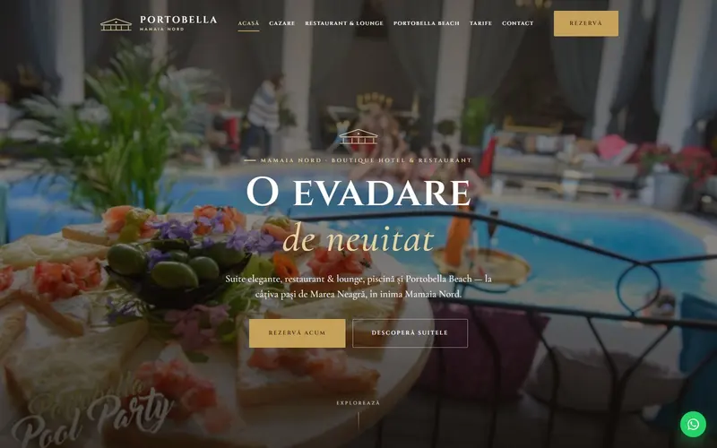
Only real projects, already on our site.

Questions
What clients ask us.
What do you need to know about the restaurant?
What you cook, who comes in and what the room looks like. A few photos of the place and the plates tell us more than any description.
Do you design the menu too?
Yes. Once the logo is done, we lay out the printed menu and the QR menu in the same identity. If you can’t decide between them, we wrote a piece on QR versus printed menus.
Will the logo work on an illuminated sign?
We check it on a mock-up of the façade from the start. Built-up letters and light boxes are made through Optical Merch & Print.
Who owns the logo in the end?
You do. After full payment, the economic rights to the final deliverables pass to you through a written assignment, as set out in our Terms.
I already have a logo. Can you reuse it?
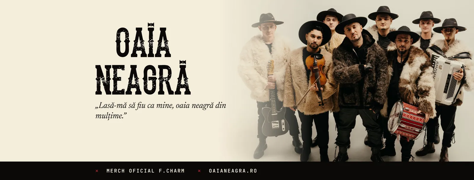
Yes. Often you don’t need a new one: we redraw it cleanly as a vector and build the rest of the identity around it, as we did for Oaia Neagră and Major Music.
How much does it cost?
It depends on what it covers: how many pieces, how many versions, whether printing or production is included. Tell us what you need and we come back with a clear quote, after a short talk.
From the blog
Short guides on the topic, written in the studio.
Brand identities
Let’s start.
Tell us in two lines what you need. We come back with a plan and a clear quote.