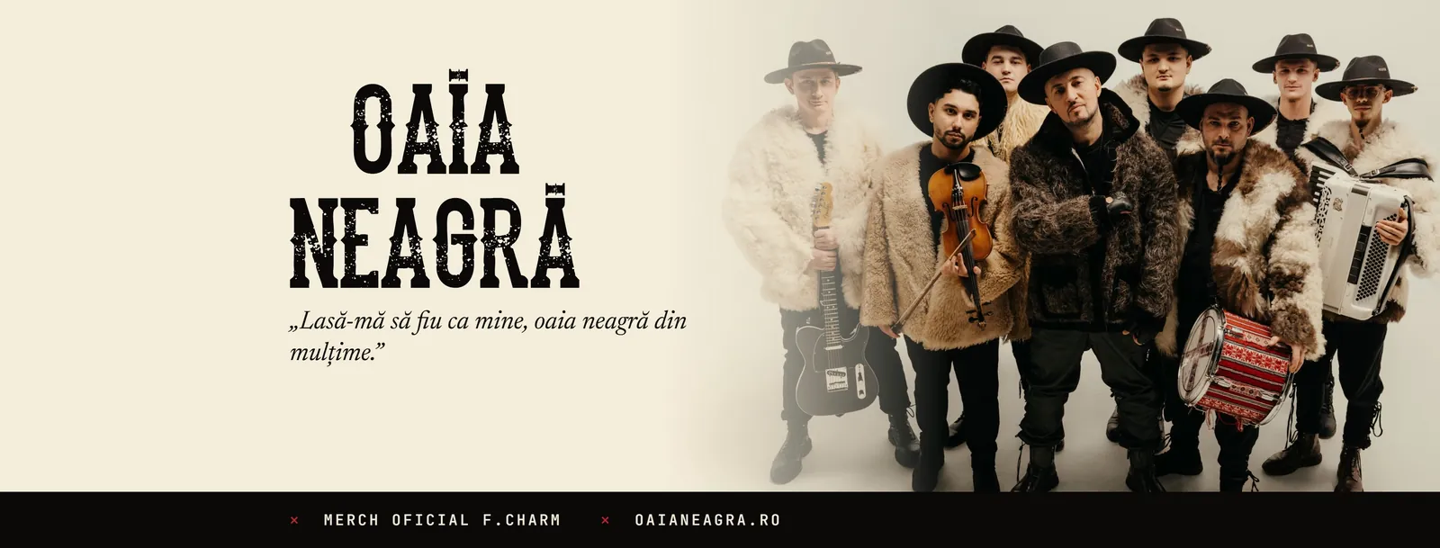
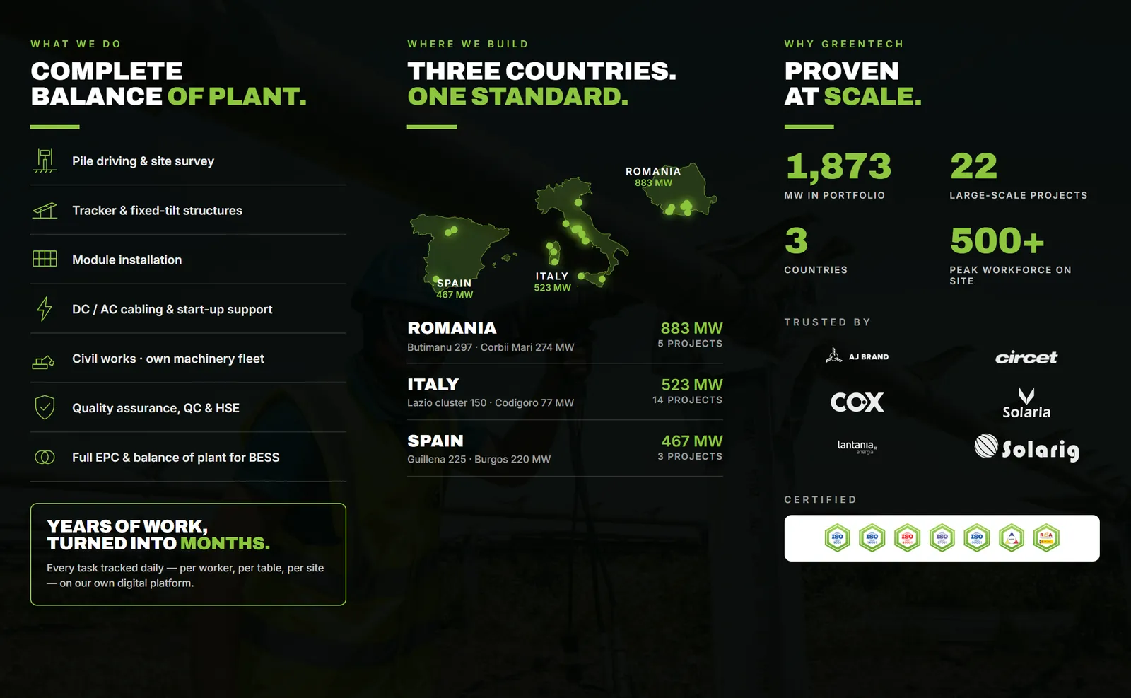

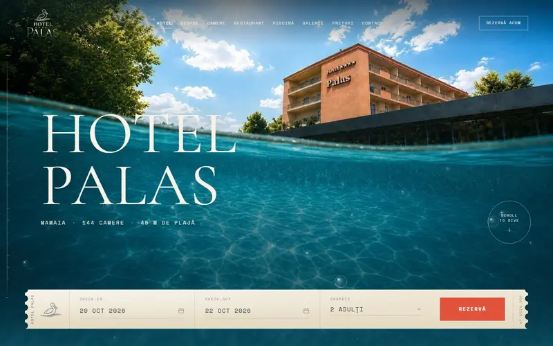
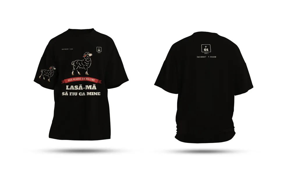

Most brands need two fonts: one for headings and one for body text. Before taste comes into it, check three things: that the license covers everything you do (logo, print, website), that the font has every character your language needs, and that it reads well at small sizes. Only then pick the pairing you like.
Check the license before the logo
The fact that a font is installed on your computer tells you nothing about what you're allowed to do with it. Every font has a license, and it may treat print, websites and apps differently.
Two common sources with clear rules:
- Google Fonts. In its FAQ, Google says the fonts can be used commercially, even inside products that are sold, and on any surface: print, websites, apps, storefronts. Most are under the SIL Open Font License, some under the Apache License or the Ubuntu Font License.
- Adobe Fonts (included with a Creative Cloud subscription). Adobe says you can use the fonts to create a logo and that the logo can be registered as a trademark. What to know: if you cancel, files with the font embedded (PDFs, images) and text converted to outlines keep working, but live documents (InDesign, Word) will show a missing-font warning. On websites, Adobe fonts can only be added through the embed code Adobe provides.
For fonts bought from a type foundry, read the license and see what it covers: print, web, app, how many computers. Sometimes each is a separate license.
For logos, our rule is simple: in the final file, the text is converted to outlines. That way the logo looks the same everywhere and doesn't depend on an installed font. More on this in our piece on vector logos versus image logos.
Special characters: the ten-second test
Romanian is a good example of why this matters. The correct ș and ț have a comma below, not a cedilla. Unicode has them as separate letters, added specifically for Romanian (Ș ș Ț ț, U+0218 to U+021B). Many fonts, especially free or older ones, only have the older cedilla version or none at all.
What happens then: the software borrows the missing letter from another font, and a mismatched ș shows up in the middle of your heading. On a large poster or a storefront sign, you can see it from across the street.
The test: type a sample with every special character you need in large size, for Romanian something like "Știință, țară, ȘȚ, așa", and look at each letter. If the marks are right and every letter looks like it belongs to the same family, the font passes.
Pairings that work
Two fonts work together when the difference between them is clear and has a purpose. A few practical rules:
- Clear contrast. A serif for headings and a sans-serif for text, or the other way round. Two very similar sans-serifs look like a mistake, not a choice.
- One family, several weights. Often a single good family with 2–3 weights (regular, semibold, bold) does a cleaner job than two families.
- The heading font can have character. The body font should stay calm, because people read it in long paragraphs.
- Two families at most. A third one usually comes from indecision.
Legibility: where it really counts
A font that looks great at 60 points can become hard to read at 7 points on a business card. Where to test:
| Where | What to check |
|---|---|
| Business card | phone number and address at actual size, printed |
| Website on a phone | paragraphs on a small screen, in bright light |
| Signage and vehicle graphics | reading from a few meters away, while moving |
| Menu | dish names and details in dim light |
Very thin weights are the riskiest. On paper they can break up in print, and on screen they need more contrast. The W3C guidance on contrast (WCAG 2.1) flags exactly this: very thin or unusual fonts may need more contrast than the stated minimum.
What goes in your brand guide
- The name of each font, the weights you use, and where (headings, text, buttons).
- Where to download it and what license it has.
- Minimum sizes for print and for screen.
- A system fallback font (Arial or Georgia, for example) for email and Office documents, where your brand font isn't installed on the recipient's computer.
You'll find a template in our piece on the one-page brand guide.
Once you have your fonts, the first real test is a printed business card: it shows you right away whether the small text holds up.
Sources
- Google Fonts FAQcommercial use on any surface, OFL, Apache and Ubuntu Font License
- Font licensing, Adobe Fontslogos and trademarks, what happens if you cancel, web fonts via embed code
- Latin Extended-B, Unicode Code ChartsȘ ș Ț ț with comma below (U+0218–U+021B), "Additions for Romanian"
- Understanding Success Criterion 1.4.3: Contrast (Minimum), W3Cthin fonts may need more contrast
Checked: surse Xenia Pușcașu · editare Nora Vlăsceanu · SEO Mihnea Tăbăcaru