



A small business doesn't need a 60-page identity manual. It needs one page it can send to the print shop, to whoever builds the website, and to anyone putting the logo on a T-shirt or a van. That page holds the logo in its versions, the colors with every code, the fonts and a few simple rules.
Why one page
Nobody reads long guides. They end up in a folder, and a year later someone sends you a mockup with a squashed logo and the wrong blue. One page gets printed, pinned to a wall, emailed in two seconds. If you need more, you can add it later. The first page you can use tomorrow.
What goes on the page
1. The logo and its versions
- Primary version, full color, on a light background.
- One-color version, black and white, for stamps, engraving, single-thread embroidery or a fax.
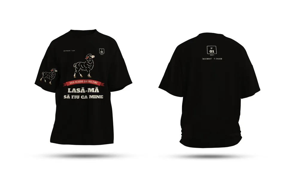
- Reversed version for dark backgrounds, like black T-shirts or photos.
- The symbol on its own, if the logo has a mark and a wordmark, for social avatars or a favicon.
Source files are vector: AI, PDF or EPS for print, SVG for the web. SVG is a vector format, so the logo stays sharp at any size. Why that matters to the print shop is in our article on vector logos.
2. Clear space and minimum size
Clear space is the area around the logo where nothing else goes: text, another logo, the edge of the page. You usually measure it with a piece of the logo itself, like the height of one letter. Minimum size is the point below which details get lost: write it in millimeters for print and in pixels for screens.
3. Colors, with every code
This is where things go wrong most often. The same color has different codes depending on where it shows up:
| Code | Where you use it |
|---|---|
| CMYK | print (business cards, flyers, posters) |
| Pantone | spot color printing, screen printing on T-shirts |
| RGB | screens, presentations, video |
| HEX | website, apps, social media |
If you only give the HEX, the print shop converts it as best it can, and your blue comes out different on paper. We covered why screen colors and printed colors differ in our CMYK and RGB article.
Add one note for the web: body text on a site needs a contrast ratio of at least 4.5:1 against its background under the WCAG 2.1 accessibility standard. The logo itself is exempt, but text set in your brand color isn't. If your yellow on white doesn't pass, note in the guide that text uses a darker shade.
4. Fonts
Two, three at most: one for headings, one for body text. Write the exact name and the weights you use (Regular, Bold). Check the license: some fonts are free for print but need a separate license for a website or an app. Fonts under the SIL Open Font License, for example, can be used, embedded and redistributed freely; the one thing you can't do is sell the font by itself.
5. What not to do with the logo
Four or five drawn examples, crossed out in red: stretched or squashed logo, changed colors, an added drop shadow, the logo on a busy photo where it can't be read. A drawn example explains more than a paragraph.
What the page looks like
A layout that works: the logo at the top, large, with the clear space marked. Below it, the versions in a row. In the middle, the color swatches with their codes underneath. At the bottom, the fonts set in themselves and the row of things not to do. All on one A4 sheet, so it prints.
Once you have that page, orders for business cards or company materials come out the same every time.
Sources
- Understanding Success Criterion 1.4.3: Contrast (Minimum), W3C4.5:1 contrast for text, 3:1 for large text, logotypes exempt
- SIL Open Font License 1.1, official textwhat the license allows (use, embedding, redistribution) and the ban on selling the font by itself
- SVG: Scalable Vector Graphics, MDN Web DocsSVG is a vector format that renders at any size without loss of quality
Checked: surse Xenia Pușcașu · editare Nora Vlăsceanu · SEO Mihnea Tăbăcaru