



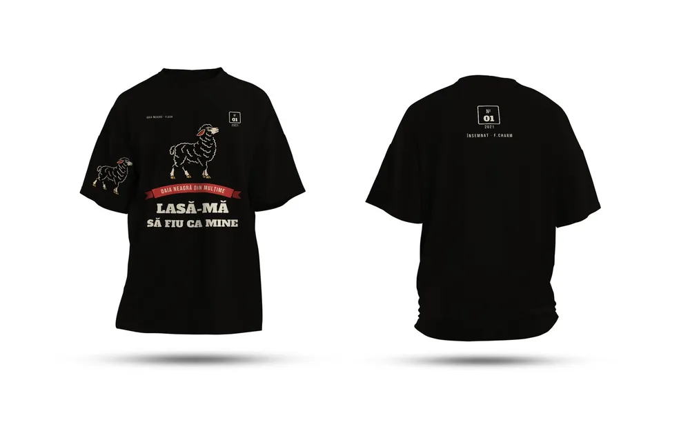

Most small businesses need one or two brand colors plus two neutrals: a dark one for text and a light one for backgrounds. If you want, add one accent color for buttons and announcements. Every extra color is one more place where print, screen and vinyl can drift apart.
Give every color a job
A good palette isn't a list of colors that look nice together. It's a list of roles. Once you know the role, you know where the color is allowed to show up.
| Role | Where it appears | How often |
|---|---|---|
| Primary | logo, storefront sign, T-shirt, menu cover | everywhere, it's your signature |
| Secondary (optional) | backgrounds, illustrations, inside pages | often, but behind the primary |
| Dark neutral | body text, icons | all the text |
| Light neutral | background, white space | all the background |
| Accent | buttons, "new" labels, special offers | rarely, so it stands out |
The accent works precisely because it's rare. Put it on every heading and it stops pulling attention anywhere.
Why fewer colors hold up better
Each brand color has to be written in several "languages." For print you need CMYK values and, if you use spot colors, a Pantone code. For your website and social media you need RGB and HEX. For vehicle wraps or a lit sign you look for the closest vinyl in the supplier's swatch book.
With two colors, that's a handful of codes you check once. With six, it's dozens of values that have to stay consistent across business cards, the website, the van and the packaging. We cover the screen-versus-print gap in more detail in our piece on CMYK and RGB.
Same color, different paper
This is where most people get tripped up. Pantone codes end in a letter: C for coated paper (with a glossy coating) and U for uncoated paper (matte and absorbent). X-Rite's support page for Pantone guides says it plainly: the same Pantone color printed on coated and uncoated paper looks quite different.
In practice:
- list both the C and U versions in your brand guide, so the printer knows what to aim for on each stock;
- if your business cards are on matte card and your flyers on gloss, ask for a proof of each, not just one;
- the screen only shows a simulation, so make the call on the printed proof.
Contrast decides which colors work for text
A color can be perfect in a logo and hard to read as text. The W3C accessibility standard (WCAG 2.1) asks for a contrast ratio of at least 4.5:1 between normal text and its background, and at least 3:1 for large text (roughly 24 px, or 18.5 px if bold). Very thin fonts need even more contrast.
Yellow, light green and light orange rarely pass as text on white. That doesn't kick them out of the palette. Use them for backgrounds, bands, large icons or buttons with dark text on top.
The same standard has one more rule: color shouldn't be the only thing carrying a piece of information. If sold-out products on your site are marked only in gray, someone who has trouble telling colors apart won't notice. Add a word or an icon.
Choosing your palette, step by step
- Start with where the brand will live: storefront sign, T-shirts, website, menu, vehicle. A color that glows on screen can look flat on a black T-shirt.
- Pick the primary color and look at it on white and on black, small and large.
- Pick the neutrals. Often a very dark gray with a hint of the primary feels warmer than pure black.
- If you need one, pick an accent that reads well next to the primary.
- Put every color in your brand guide with all its codes: HEX, RGB, CMYK, Pantone C and U. See also our one-page brand guide.
- Ask for a print proof on the actual paper before the full run.
If you're preparing your first printed pieces, start with business cards. They're the simplest place to see how your palette behaves on paper.
Sources
- Understanding Success Criterion 1.4.3: Contrast (Minimum), W3Cthe 4.5:1 and 3:1 thresholds, what counts as large text, thin fonts
- Understanding Success Criterion 1.4.1: Use of Color, W3Ccolor shouldn't be the only way to convey information
- Pantone Coated vs Uncoated guides, X-Ritethe same Pantone color looks different on coated and uncoated paper
Checked: surse Xenia Pușcașu · editare Nora Vlăsceanu · SEO Mihnea Tăbăcaru